As you leave the dark gallery area of the Chihuly Garden and Glass in Seattle you step into areas where the glass objects interact with natural light. The glass glows in both environments. Talk about blowing your mind on color. In the transition area is a wall filled with blown-up images of old postcards depicting a collection of landmark glasshouses in gardens around the world. Right before walking into Chihuly’s glasshouse you get a sense of this unique type of architecture. I was reminded of walking into the Sainte-Chapelle Chapel in Paris. Maybe I was experiencing “art as a protective covering”. Chihuly’s glasshouse is asymmetrical and contains a 100 foot suspended sculpture.
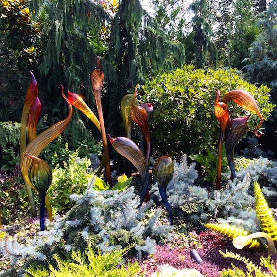
Exiting the glasshouse you enter the gardens where the glass interacts with nature.
I loved the way plants were used as a backdrop for the glass. In an area confined to black and white coloring, covering the ground was black mondo grass. (It is not often you can find a plant that can give you such a background color and texture. Works wonderfully here. I mentioned this plant before and how I combined it with chartreuse plants, although, in our garden I can only use it in containers since it is not a California Native. TM sets the rules on that!)
Black mondo grass covering a hill, this time…
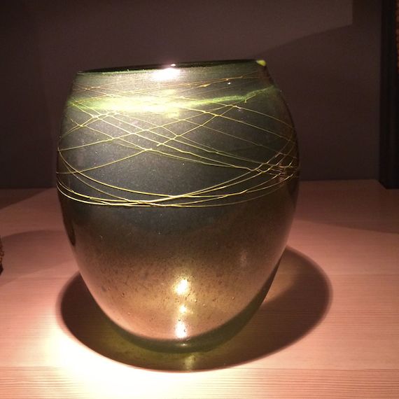
It was time for lunch before going up in the Space Needle, so we went back inside to the cafe connected to the garden. It seems Chihuly is also an inveterate collector (the cafe is called Collections and his personal collections are everywhere.)
The ceiling contains his collection of accordions…
Walls have a collection of his paintings and figurines…
and the tables to eat at were the coolest…a box covered with glass was in the center of each table and inside was one of his collections.
The food was good, too…later, coming down from the Space Needle I got this bird’s-eye view of the layout of the garden…
There are some nice videos on Chihuly’s website. Worth the time to watch…
After walking past the wonderful Gehry building in Seattle, we came to the Chihuly Garden and Glass exhibit.
Walking in, you enter into a series of galleries that contain Chihuly’s early work.
His series that referenced Native American baskets…
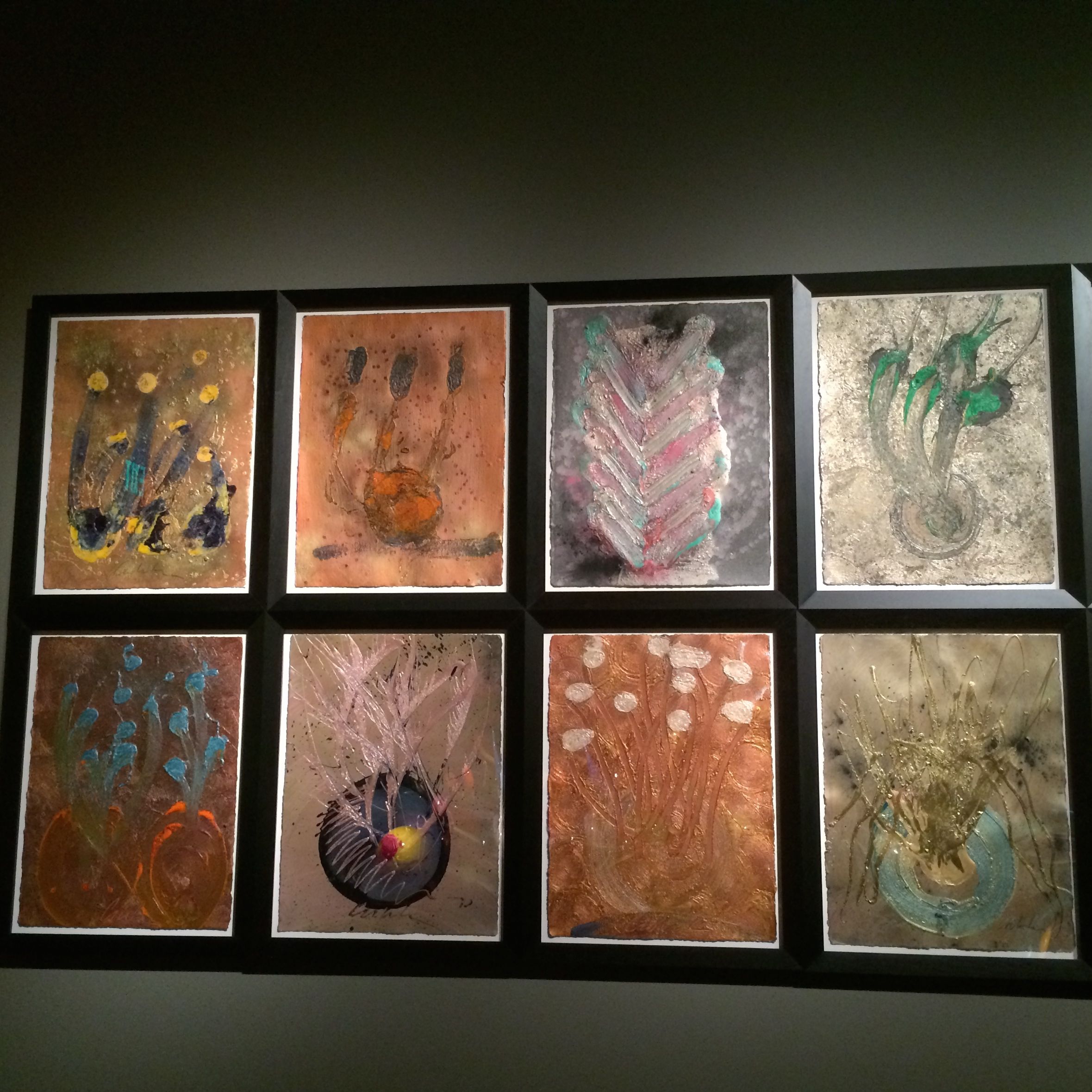
All together there are eight galleries and two drawing walls that give a comprehensive collection of his work.
Textures made when the glass was expanded creating fissures in the gold leaf on its surface…and the drawings he makes before starting a piece…
Some works are monumental…
and some are on the ceiling like a skylight…
throwing their reflections against the wall…
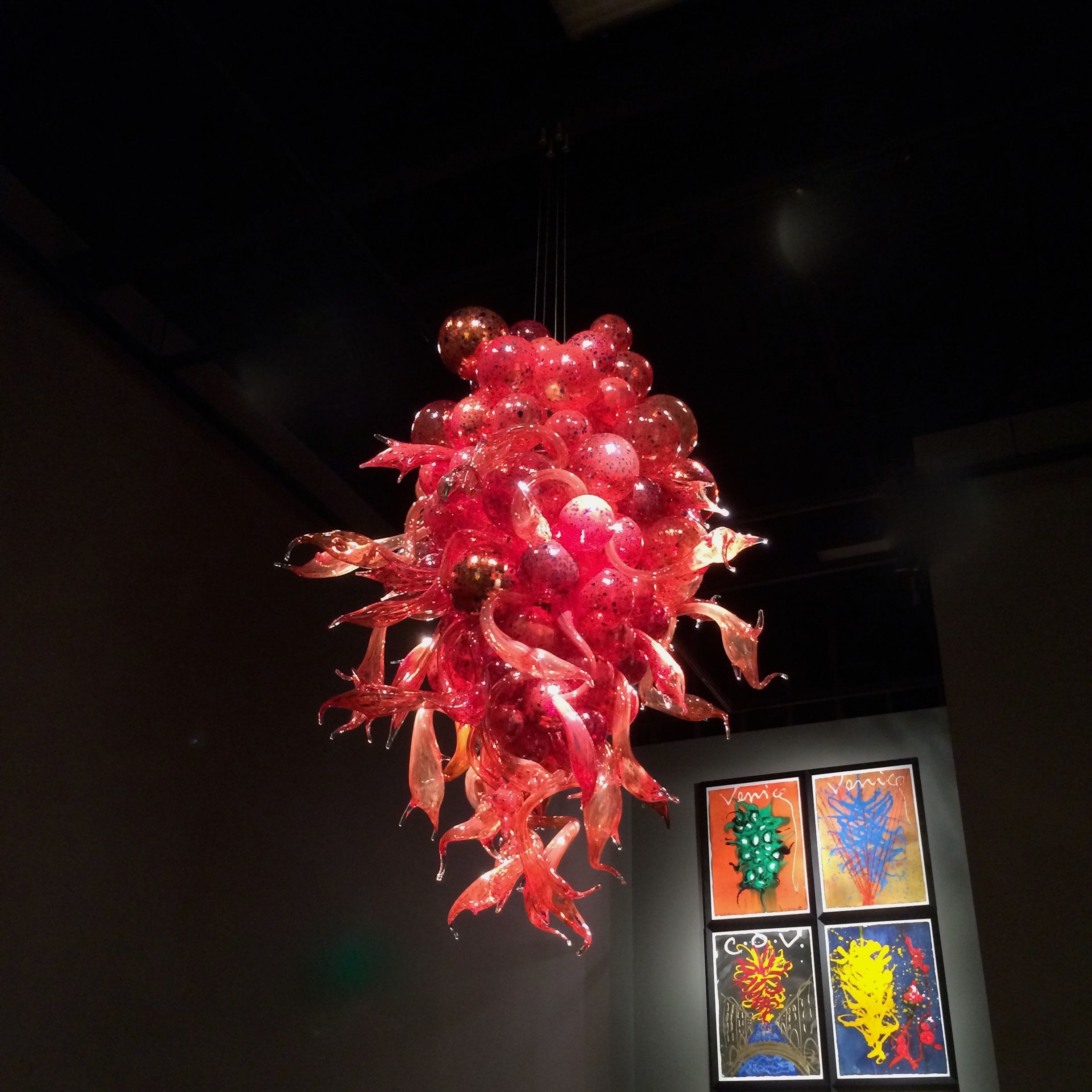
The galleries are totally black with the glass work sitting on black pedestals. The colors glow from small spotlights. The only processing I did of my pictures was to retouch the tiny white rows of lights. The color is all Chihuly. If I lived in Seattle and was prone to depression because of lack of light, I would make my way here as often as possible to give my mental health a boost. I muttered reverentially the word “color’ as I walked through these rooms and have thought about the vibrancy of the experience continually since I have been home.
The shiny pedestals also make for interesting reflections…
The first picture wall with the works in Golden acrylic paint and lots of iridescent powders…(love that squirt bottle he uses)…
The chandeliers he made for over Venice canals…
The last of the galleries had his series…I will let him speak for himself…
Oh, yum…part two will be the garden and glasshouse…
After having such a fun Thursday, I am compelled to detour away from my tales of Switzerland just a little bit more. It is no secret that I have a passion for tile (in particular Heath), so when an opportunity came to visit San Francisco with a group of retired teachers from the school where I taught before going to Moraga’s JMIS, I was very excited. My heart skips anytime there are mosaics around. We started the morning by traveling to the Flora Grubb Gardens Nursery. Lots of inspiration there and it was well worth the trip as a prelude to what was to come. (They even have a coffee bar…can’t ask for anything more!) Loved this old car planted fully making itself into a garden ornament. Emphasizing the rule that anything can be a container…
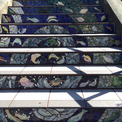
Then we drove to the Golden Gate Heights Neighborhood. This is in the Inner Sunset District and at 16th Street and Moraga Street are the steps. These 163 panels are of a sea to sky theme all the way up to the top. They are constructed with Heath Tile, handmade tile, mirrored tile and since it is a neighborhood supported project there are dedications, remembrances, and names of people and businesses from the neighborhood. The mosaic was completed in 2005 by Aileen Barr and Colette Crutcher. The stairs are used for exercise and tourists come to photograph them. They are well used by the residents. We were there at around noon with full sun making photography tricky (I have mentioned before the difficulty taking photos with an iPhone with bright light and glare. There was also the factor that some areas were in sun and some were in shade.) Despite the handicaps, it was fun to photograph this artful reflection of a community.
This woman ran up and down the stairs four times before our group had made it to the top once. Her feat was very impressive!
I did love the use of the mirror tile…
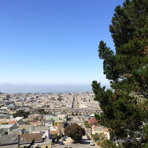
And then we were at the top…if you squint you can see the top of the Golden Gate Bridge…
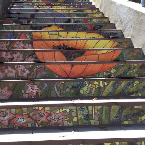
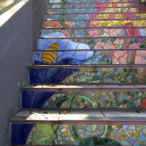
After walking down again, we went over to the Hidden Garden Steps located on 16th between Kirkham and Lawton. These steps were approached from the top and we walked down each flight to look back up for the impact. (It was definitely an impact!) These steps were dedicated in 2013. Once again you could purchase a tile to have your name on it or a business could purchase an entire motif such as a flower. (Here are photographs of how the artists plotted out the designs.) My pictures are from the top working down.
Luckily for us, one of our group members was Susan Dannenfelser, a ceramic artist, who knows the artists who created the mosaics. Aileen Barr met us and guided us around her work. This is Aileen resting on her artwork (or is that resting on her laurels…I think there probably are some laurels in this garden!)
Came home from this field trip pumped up and ready to create…thanks Del Rey Rovers for the great day!!
My friend Lisa and I went for coffee and a photo walk last Saturday. It was a lovely day in my neighborhood (hard to tell it is winter) and I worked on my video technique…no tripod so some shaking going on but for the most part did not try to pan. My goal was to be brutal in my cropping and brutal in my leaving out of unnecessary shots but still I keep thinking that it needs to be as long as the music. Maybe next time I will concentrate more on what can be done with the audio.
My town has a community center that was built in the 1930’s and recently they built a new library. I think they did a nice job of melding the structures together. Plus I like the public sculptures they have situated around the site. Quite whimsical… (wouldn’t want this town to take its self too seriously!) As always I am fascinated by the color and texture. Most of all it was fun to do art with my friend and visit my most favorite coffee store in town.
1. I was teaching a class last Saturday and I was thinking a lot about ways to talk about and experiment with composition.
2. I added another new app to my library of apps. This one is ProHDR and I thought it might help me get better color in pictures taken inside. HDR stands for high dynamic range. You need to stand very still for a while because it actually takes two pictures that it then combines. One picture is high contrast and one is low contrast. You get the full range in the final combination rather than having your picture drop out the low.
3. Recently I had my friends from the school where I used to teach come over for a party. When people walk in my house they usually remark on the amount of color on the walls (I am the one with stair risers that are each a different tile color), so I found myself uttering one of those crazy statements (like “chartreuse is the new black”) and then waiting for chuckles. I do not know where it came from but I heard myself say, “When you live in a ’50’s Rancher, color is your best friend.” Seemed so right at the moment. I do not know if anyone else laughed, but I did.
I took the pictures with the ProHDR app and then put them in Infinicam for a frame. The corners of framed art I have on my walls formed the composition against the various wall colors. If I remember the color I will add it because sometimes the name of the color impressed me along with the color itself.
A bedroom with the color “ink” on the walls and lots of white on the woodwork and trim.
The family room where each wall is a different color including a teal, “dark linen”, and “gold finch”.
On the kitchen walls is “cornsilk”
The dining room has grayed purple with a copper border. The matts around the framed prints are a sage green.
The living room with “canvas tent” and a pale blue accent wall.
And the purple front door.
This turned out to be a nice exercise for thinking about composition and even though I was never much into having diamonds, I do like to say, “A girl can never have too much color”…
There is nothing quite like the experience of visiting with friends that you haven’t seen in a very long time. Friends who thirty years ago lived a few blocks away on Eureka Street in Redlands, came through Northern California from Pennsylvania. In the intervening time we had a few visits, but not since both of our kids were in elementary school and we swung up to Pennsylvania after a trip to Washington, D.C. Jan and Dick Crooker had lived in Redlands and Jan had been one of my first ceramics professors at Cal State, San Bernardino, before they moved to Kutztown, PA, where Dick has been a geography professor since. Jan also continued to teach at the college level and create art. Amazingly, she no longer works in clay, and now along with teaching drawing classes and art education classes at a couple of colleges, she does plein air painting. Jan’s website is here.
The years fall away and the conversation just takes off (husbands barely able to get a word in edgewise), and of course when people like art, color is interspersed in the conversation. Jan drops cogent one line statements wherever possible, so when I relate some of the great things she said, you must imagine a small grin on her face and hoots of laughter from her audience (me). This was my favorite: She had on glasses frames that I really liked, with orange circling the lens and turquoise on the ear pieces. I complemented her on how great the frames were and her response was, “You know, I always say, I can get older, but I can’t get duller.” Here comes my hoot of agreement. Color makes the aging process slow down!
Rehoboth Hideaway
Jan’s plein air painting is done with acrylic. She loves going on location and painting outside. Rehoboth is a beach community in Rhode Island with an exciting art organization that has festivals that she participates in.
I absolutely love this group:
A Month of Sunny Days
partial view
She spent the month of August one year, painting one canvas each day, in the spirit of postcards. I love the effect of them grouped together and I have tremendous respect for them as a symbol of the discipline it took to accomplish all of them in one month.
We found we both had copies of The Yellow House that tells the story of the time that Van Gogh spent living in Arles trying to convince Gauguin to stay and form an art colony with him. Can you imagine those two personalities together?
Jan mentioned that she starts all of her canvases with a layer of orange paint as a second primer because it makes the colors put on top pop. After she started doing this, she took one of her college classes on a field trip to one of the big museums in New York City where they saw a selection of Van Gogh paintings. She found if you got up really close to his paintings, you could tell that Van Gogh also used a layer of orange underneath. As Jan says, “If it was good enough for Van Gogh, it should be good enough for the rest of us.”
She walked into my house carrying a Baggallini purse. My Favorite!. Years ago, I found I had to stop carrying large satchels due to shoulder pain, so I switched to Baggallini urban backpacks and my very first was orange (when that wore out I had a black one, but quickly had to supplement with a purple.) They are so well designed it is crazy. Jan’s statement: “Orange is the new black,” I would like to amend to include “Orange and chartreuse are the new black, and purple has been black for a long time, too.” Turquoise will undoubtedly be joining them soon.
Sunday morning I had sent Terry to the store with a list that included olive bread because I love Grace Baking olive bread and thought we could use it while Jan and Dick were here. Jan walked in my front door with a loaf of olive bread as a hostess gift. I did not have a chance to make this recipe, but I must include it here. I wonder if they have artichoke dip in Pennsylvania?
Toast a slice of olive bread and spread it with artichoke dip. Place a few leaves of arugula on top. Gently fry, over-easy, an egg in a touch of olive oil. Sprinkle with sea salt and freshly ground pepper and place on top of the arugula. Splash a little balsamic vinegar on top of the egg. Great breakfast with a glass of orange juice!
I will share one last art tip. A wonderful tool I used back in my days as an art teacher were the colored pencils by Prismacolor called Art Stix. They are woodless colored pencils in a square shape. So, for kids that have a physical disability, they are great in that they are less likely to roll off a table, they don’t have to be sharpened as often, and the Stix have the ability to cover large areas rapidly because the flat side can be used for fill in instead of using just a point. So Jan talked about using the same tool in her college level life drawing classes. Her twist is that she has her students sharpen one end to a point so that there are three ways to use the one drawing tool. Traditional point, edge of the square, and flat. So, I started sharpening my box of Art Stix, starting with orange, chartreuse and parma violet. Too, cool!
There was a lot of laughing going on during our visit, and as Jan says, “If we wait another twenty years, we will be too old to have any fun.” Here’s to visits with friends, may they be more frequent!
The title of this blog entry is an example of sixth grade humor, I hope you laughed out loud, and now I am off to prime some canvases (with orange.)
Last Sunday we detected our first Iris starting to peek out into the world:
A day of rain on Monday, and then on Tuesday it burst forth like this:
Not a great specimen, but the thought is what counts.
For weeks the little leaves on the gooseberry have turned more and more green and gotten larger and larger. This is the state they are in:
Not to mention the hydrangeas:
and the daffy daffodils:
Oh, well, I lied about the hydrangeas and the daffodils, I went to Trader Joe’s this morning:
But still, even though there is so much rain, things feel like they are perking up in California. The dulled grey greens of winter are beginning to take on their spring vibrancy. Hope it doesn’t freeze and set things back….Besides, iphone camera aps (not diamonds) are a girl’s best friend. I just want to have fun!
Today, during a slight rainstorm, I decided to let the sun shine in. I have a Meyer lemon tree that needed to be harvested. Last year (its first) it produced one lemon and by the time I harvested that singleton, it had rotted. So today, out to the tree and, although they were not very big, there were twenty three of them. Ta, dah:
I came inside, dried off, had a cup of tea with lemon, and gave them their own bowl. It is the little things that make it sun shiny, despite all the rain. Such a great yellow.
I plan to smile all week and use them in everything!


